This conference visual identity case study explores how Colorteam designed a scalable system for NECLive 2025 that could communicate cultural depth while supporting high-volume conference communications.
Client: NECLive Conference
Industry: Creative economy · Culture · Media · Events
Scope: Visual identity system, theme artwork, templates, and digital assets for NECLive 2025
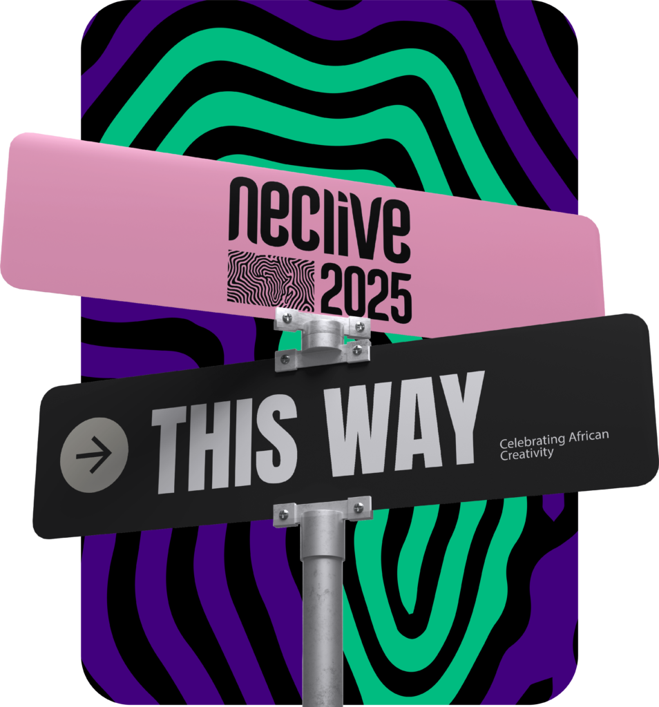
Project Overview
For its 2025 edition, NECLive needed a visual identity that could do more than look distinctive. As one of Africa’s leading platforms for creative and cultural dialogue, the conference required a system that could scale across dozens of touchpoints, remain culturally grounded, and communicate its theme with clarity and depth.
Colorteam partnered with NECLive as Creative Partner to design a unified visual system that could support the conference’s communications across digital, social, and environmental applications, while reinforcing its position as a serious, future-facing platform for Africa’s creative enterprise.
What is the NECLive 2025 visual identity about?
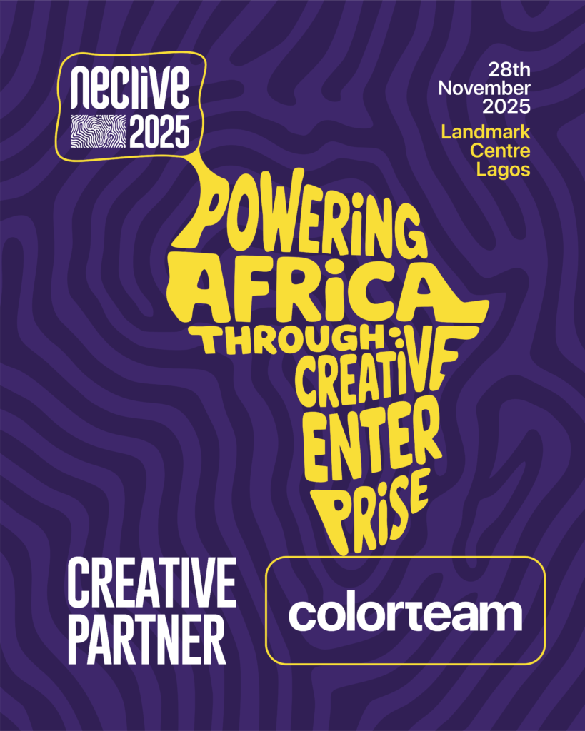
The NECLive 2025 visual identity is a scalable design system built around an African fingerprint map, symbolising how individual creativity collectively powers Africa’s creative enterprise. The system was designed to support 50+ conference assets while maintaining cultural depth, clarity, and brand consistency.
The Challenge
The 2025 theme, “Powering Africa Through Creative Enterprise”, posed a central challenge:
How do you visually express power without relying on clichés, spectacle, or overused Afrocentric motifs?
The identity needed to speak to a sophisticated, pan-African audience, work within NECLive’s existing brand system, and scale efficiently across a high volume of assets, while communicating that creativity itself is a driving force shaping Africa’s future.
What does it take to design a visual identity for a large-scale creative conference?
It requires:
- Cultural sensitivity without reliance on clichés
- A clear conceptual anchor that can scale
- Visual flexibility across digital, social, and environmental formats
- Consistency across high-volume, sponsor-heavy assets
The Concept: The African Fingerprint Map
Why a fingerprint?
A fingerprint represents identity, authorship, and human presence. Making it an ideal metaphor for creativity as a people-powered force.
The fingerprint emerged as the core visual idea. Universally understood as a marker of identity and authorship, it offered a way to represent individuality while remaining deeply human.
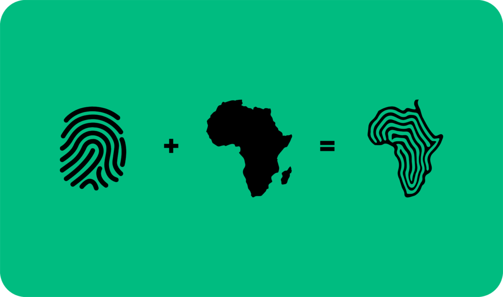
By extending fingerprint lines into flowing patterns and shaping them into the map of Africa, the concept became clear:
Africa’s creative enterprise is powered by the people who shape it. Our identity is our power.
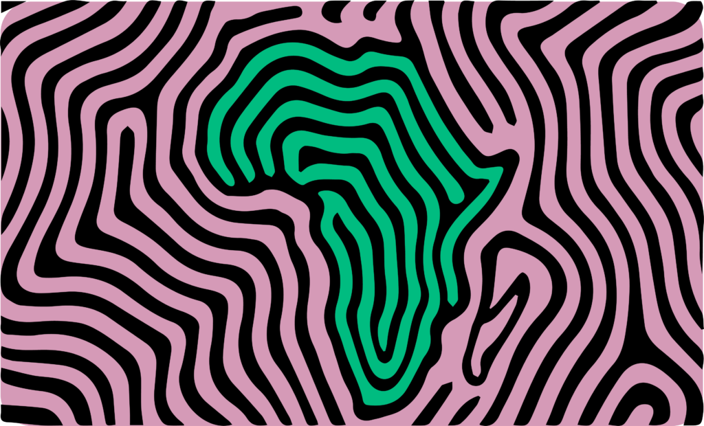
The fingerprint also functioned as a flexible design asset, capable of standing alone or integrating seamlessly across formats.
Building a Scalable Visual System
How do you design a visual identity that scales across dozens of assets?
A scalable visual identity is built by defining a core metaphor, translating it into repeatable design components, and applying it consistently through templates, patterns, and typographic rules.
Once the core concept was defined, every element was designed to support consistency, adaptability, and speed.
Edition Logo Lockup
Using NECLive’s existing typographic system, a 2025 edition lockup was developed incorporating a refined fingerprint map. This ensured brand continuity while giving the edition a distinct signature.
Theme Typography
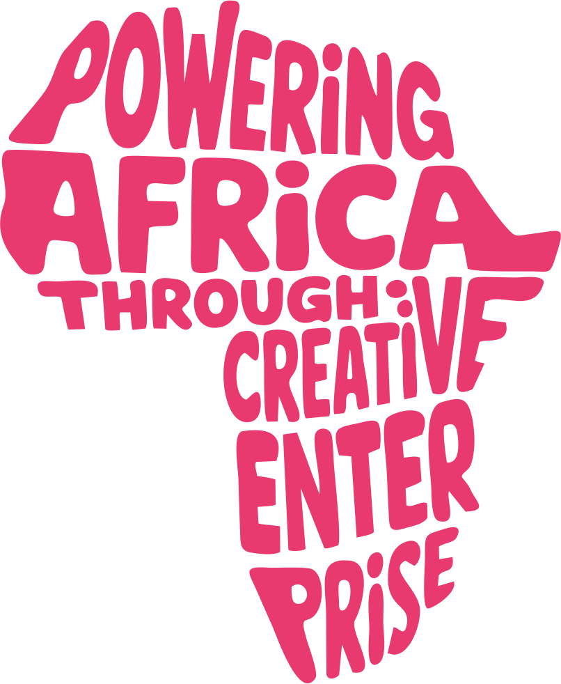
The phrase “Powering Africa Through Creative Enterprise” was warped into the silhouette of the African continent, allowing the words themselves to form the message visually.
Pattern System
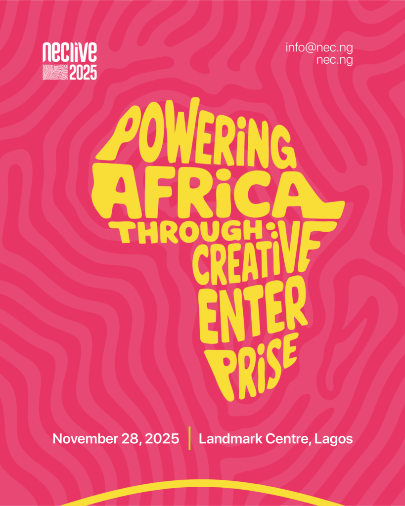
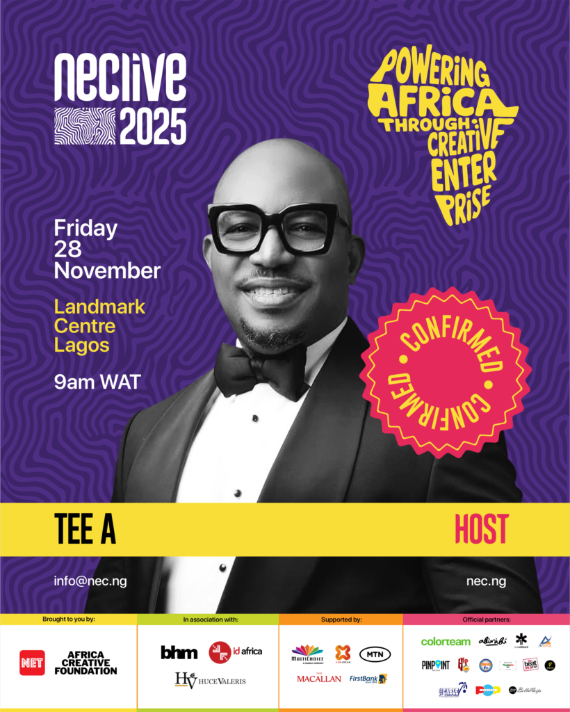
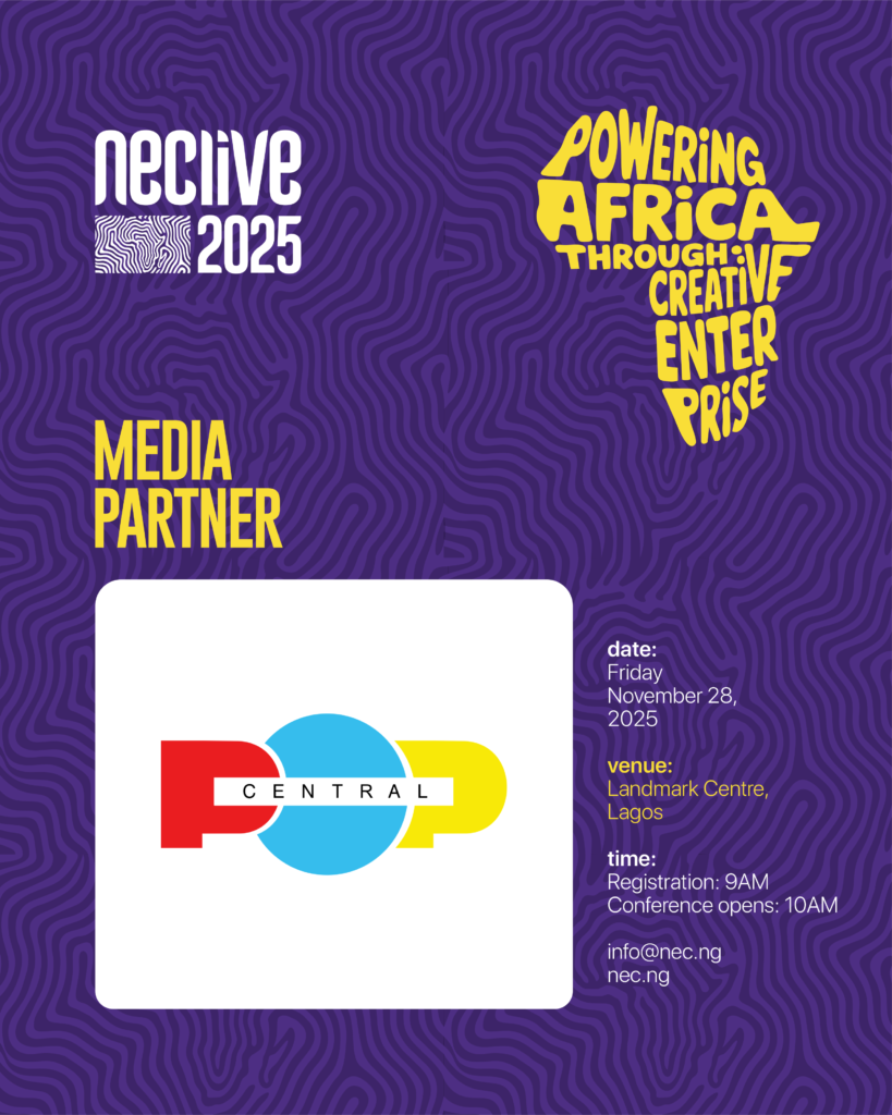
The fingerprint pattern became the foundational texture across banners, announcements, reels, story templates, and speaker features. It enabled the creation of 50+ assets with visual consistency and a recognisable rhythm.


Modular Templates
To support frequent updates, a modular template system was designed. Even within sponsor-heavy layouts, clarity, balance, and legibility were maintained across platforms.

The Outcome
Results at a glance:
- Unified visual language across 50+ assets
- Clear thematic communication without visual clichés
- A system flexible enough for rapid content production
- Strong visual recognition across conference touchpoints
The final system delivered a culturally grounded yet contemporary visual language that scaled efficiently across digital and environmental touchpoints. It unified communications, reinforced the conference theme without clichés, and positioned NECLive 2025 as a confident platform shaping conversations around Africa’s creative future.
Reflection
This project reflects Colorteam’s approach to identity design: creating strategic systems that carry meaning, support scale, and strengthen positioning.
The African fingerprint map was more than a visual device. It was a reminder that Africa’s creative power lives in people, stories, and collective imagination. Designing an identity that honoured this truth was both a responsibility and an opportunity.