This church brand identity case study explores how Kingdom Life partnered with Colorteam to develop a scalable brand identity system—moving from a generic visual presence to a distinct, system-driven expression of faith, authority, and community.
Client: Kingdom Life Church
Industry: Religious Organization · Community · Non-Profit
Scope: Visual identity system, logo design, sub-brand architecture, typography, and color strategy.
Project Overview
This Kingdom Life case study explores how Colorteam reimagined the visual identity of a growing church community seeking to move beyond a generic, indistinct brand presence.
Their visual presence had become “white noise”, the kind of generic religious imagery that blends into the background of a busy street. They were a vibrant, growing community, yet their brand felt like a placeholder. They wanted to move from being “just another church” to becoming a recognizable beacon of divine authority.
The brief was clear: Give us something that feels like us.
The objective was not simply to design a new logo, but to build a cohesive identity system that communicates spiritual authority, clarity of message, and cultural relevance in a modern context.
Rather than creating isolated visual assets, the work focused on developing a scalable visual language capable of supporting various ministry sub-brands while maintaining a unified “Kingdom” authority across ministries, platforms, and future expressions of the church.
Impact Snapshot
The rebrand positioned Kingdom Life for stronger recognition and internal alignment, contributing to:
- A more distinctive and recognizable visual identity
- Clear differentiation from generic church branding
- Unified sub-brand recognition for diverse ministries (Women, Men, Worship, Missions, and Conferences).
- Stronger consistency across digital and physical touchpoints
- Improved clarity in communication and messaging
- A modern, culturally relevant expression of faith
These outcomes reinforced the importance of building brands as systems, not just visuals.
What Is Brand Identity in a Church Context?
Brand identity within a church context goes beyond aesthetics. It is the visual and emotional expression of belief, community, and spiritual direction.
It involves translating abstract values such as faith, authority, growth, and transformation into tangible visual elements, logos, colors, typography, and layouts that communicate consistently across every touchpoint.
For modern ministries, this is critical. The “brand” must represent divine authority while remaining approachable and culturally relevant to a digital-first audience. The challenge lies in creating a system that keeps the message consistent across various sub-ministries and media formats.
The Challenge
Rebranding a church is unlike any corporate project. You aren’t just selling a product; you are representing a mission. We faced three structural hurdles that threatened to keep the brand grounded:
- The Pattern Trap: How do you create a “Christian” brand without falling into the tired clichés of doves and globes?
- The House of Many Rooms: Kingdom Life wasn’t just one entity. It was a Men’s ministry, a Women’s movement, a Worship team, and a Missions group. How do we give them individual personalities without breaking the family bond?
- The Scale of Spirit: The brand had to work on a tiny Instagram avatar and on a 40-foot stage banner without losing its “weight.”
If we failed, the brand would remain mechanical. To succeed, we had to build an engine of intention.
Our Approach
Symbolism as Strategy
The primary logo was designed as the foundation of the brand, moving away from generic icons to a custom shape representing “divine authority”. We developed three distinct logo versions to ensure versatility:
- Icon Style: Optimized for small-scale use, such as social media display pictures.
- Wordmark: The optimal look for general use across most touchpoints.
- Primary Logo: The central identity representing the core mission.
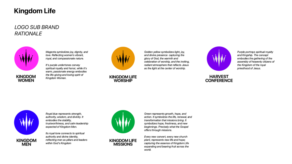
Symbolism asIntentional Color Psychology
We moved beyond a single color to a palette where every hue carries spiritual significance and functional purpose:
- Kingdom Women (Magenta): Symbolizing joy, dignity, and vibrant compassion.
- Kingdom Men (Royal Blue): Representing strength, wisdom, and leadership.
- Kingdom Worship (Golden Yellow): Capturing the divine presence and the “glory of God”.
- Kingdom Missions (Green): Representing growth, hope, and the “fruit” of the Gospel.
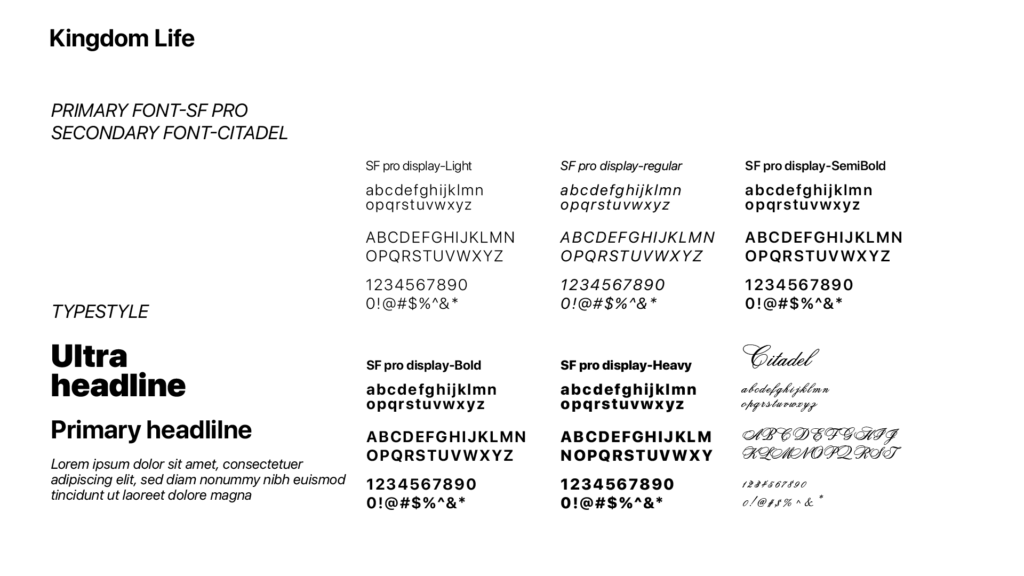
Building a Unified Typographic System
To maintain a high-end, authoritative feel, we established a strict typographic hierarchy using SF Pro as the primary font for its modern clarity, supported by Citadel for secondary applications. This ensures that every sermon title, social post, and internal document feels intentional rather than accidental.
Results at a Glance
While church growth metrics extend beyond design alone, the rebrand delivered clear qualitative improvements:
- A strong, recognizable visual identity system
- Consistent brand expression across platforms
- Improved structure for communication and design output
- A flexible system supporting future growth and ministries
The transformation shifted Kingdom Life from a generic presence to a distinct, system-driven brand.
Reflection
At the beginning of this project, the challenge wasn’t a lack of vision.
Kingdom Life already knew who they were. The problem was that their identity didn’t show it.
Like many growing churches, their message was strong, their community was alive, but visually, they blended in. Nothing about the brand signaled the weight of what they carried.
And that’s where the real work began.
Not in designing a logo. But in asking a deeper question: What does the Kingdom look like when expressed visually?
We stripped things back.
Removed the noise.
Built a structure where there was none.
Every decision, from the bold wordmark to the disciplined typography, from the color system to the sub-brand architecture, was anchored in meaning, not aesthetics.
Today, Kingdom Life doesn’t just say who they are. Their identity reflects it, consistently, confidently, and at scale.
And that’s the shift we care about most: From a brand that just exists…to a brand that communicates with authority.