

Where faith meets identity: the Kingdom Life rebrand
One crown, four city identities and five ministry sub-brands for a growing church.
 Olasubomi Archibong5 min read
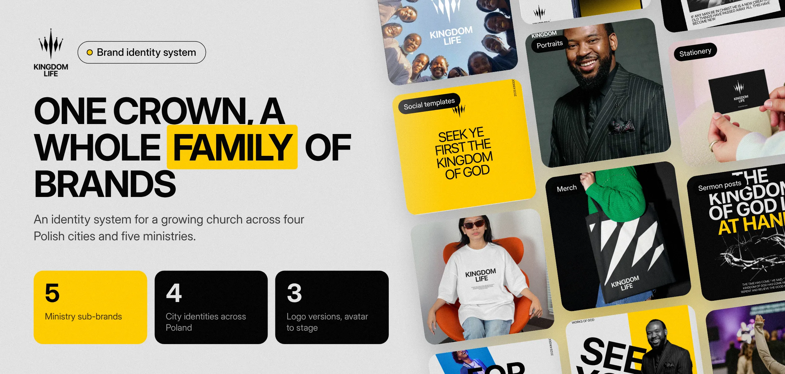
Kingdom Life was a vibrant, growing church across Poland whose brand felt like a placeholder. They already knew who they were. The problem was that their identity did not show it. The brief was simple: "Give us something that feels like us."
The challenge
Rebranding a church is unlike any corporate project. You are representing a mission, not selling a product, and the visual presence had become white noise. Three problems had to be solved at once.
- The pattern trap. A Christian brand without the tired clichés of doves and globes.
- A house of many rooms. Men, Women, Worship and Missions each needed a personality, without breaking the family bond.
- The scale of spirit. From a tiny Instagram avatar to a 40-foot stage banner, without losing its weight.
The idea: a crown, built to flex
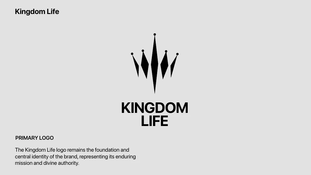
We moved away from generic icons to a custom crown shape that represents divine authority, then built three versions so the mark holds at any size. The primary logo pairs crown and wordmark as the central identity. The icon works at small sizes, from profile pictures to app icons and patterns. The wordmark is the version people see most, on everyday touchpoints.
The system
1. One family, five ministries
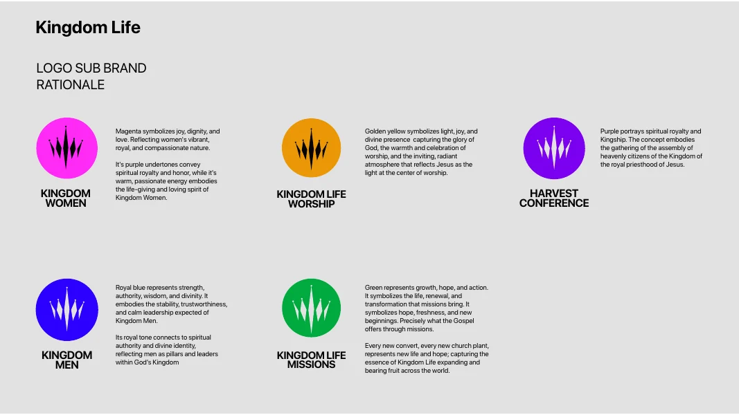
Every ministry keeps the same crown and wordmark and gets its own colour, each with a reason behind it. Kingdom Women in magenta for joy, dignity and compassionate love. Kingdom Men in royal blue for strength and calm leadership. Worship in golden yellow for light and the glory of God's presence. Harvest Conference in purple for spiritual royalty. Missions in green for growth and new life. Each feels distinct, and all of them still read as Kingdom Life.
2. One crown, rooted in every city
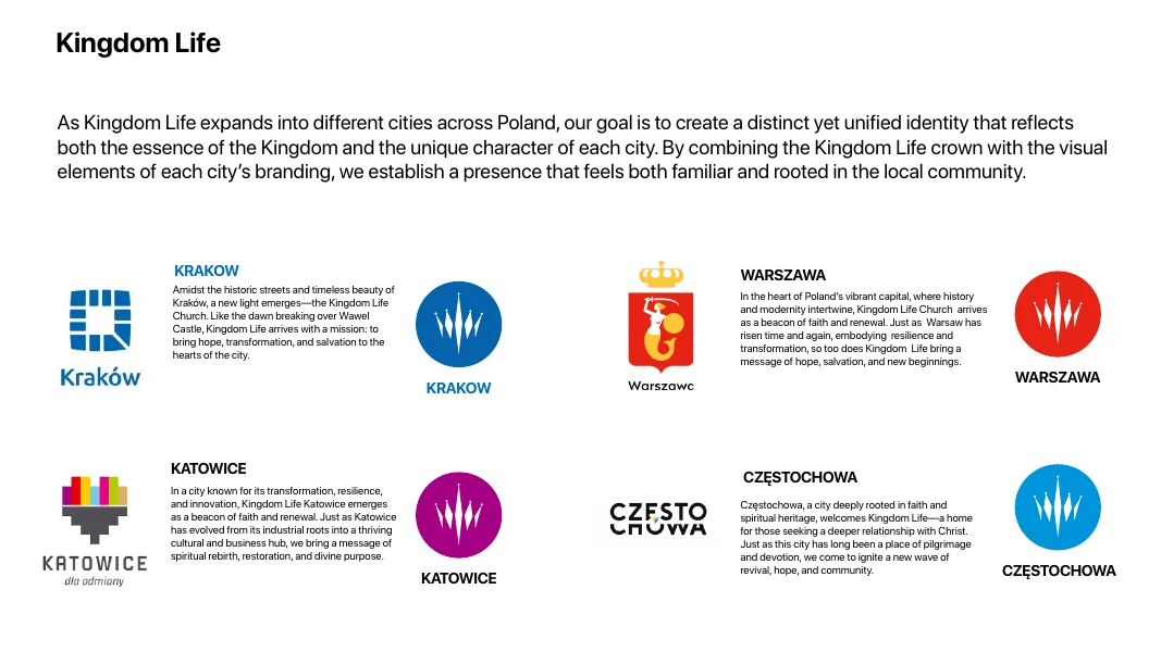
As the church expands across Poland, each city pairs the crown with its own local colours, so Kingdom Life feels familiar and part of the community. Warsaw takes the red of its coat of arms, Kraków the blue of its city mark, and Katowice and Częstochowa follow the same logic.
3. Every colour means something
Black, off-white and USC Gold carry the main brand, and the five secondary colours belong to the ministries. A strict type hierarchy in SF Pro, with Citadel as a secondary script, makes every sermon title and social post feel intentional rather than accidental.
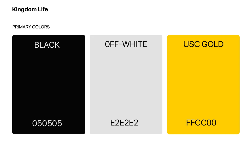
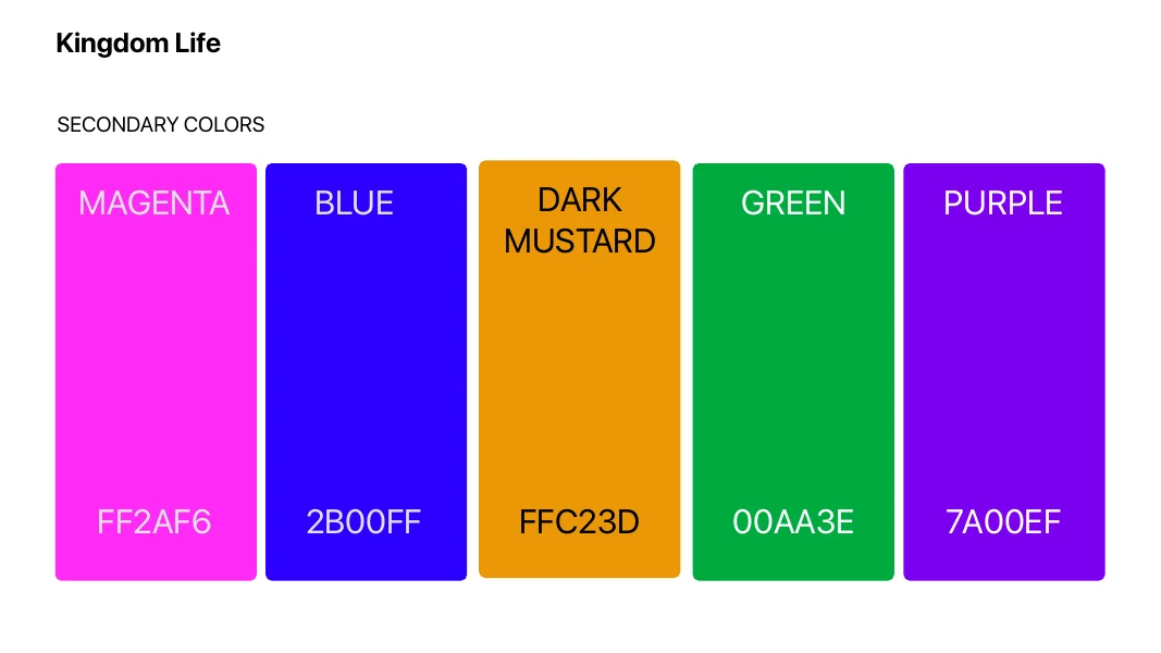
From a brand that just exists to a brand that communicates with authority.
From pulpit to profile picture
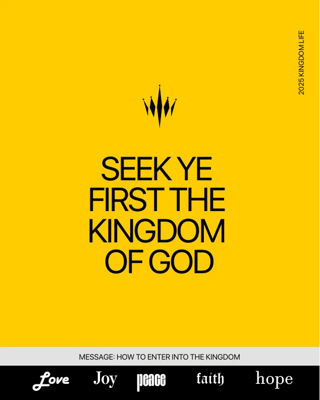
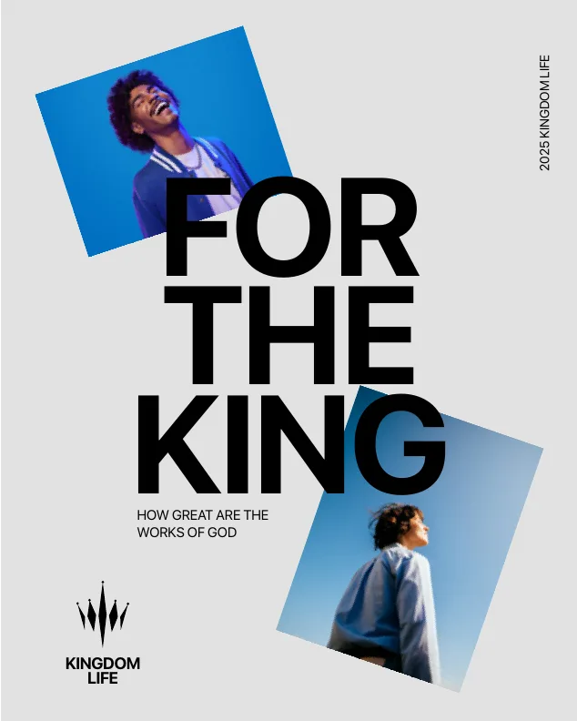
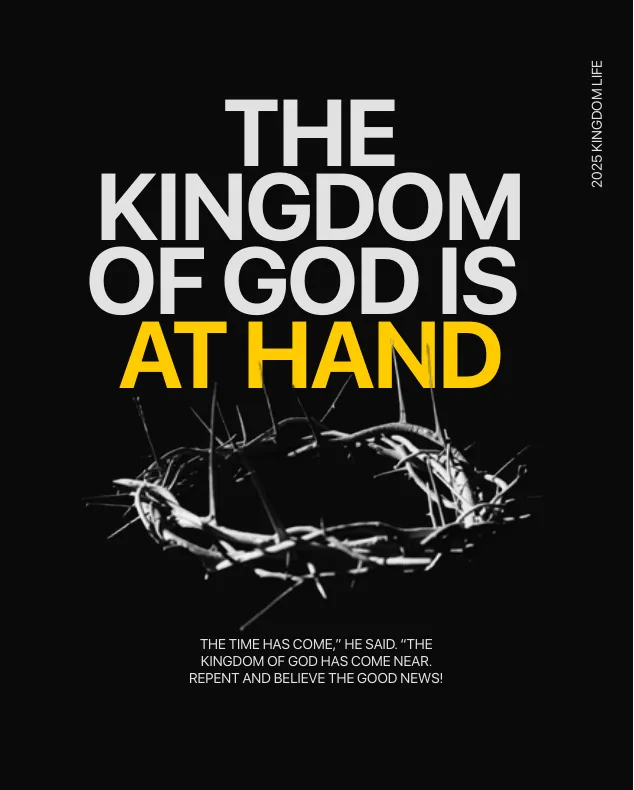
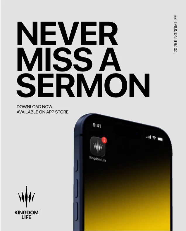
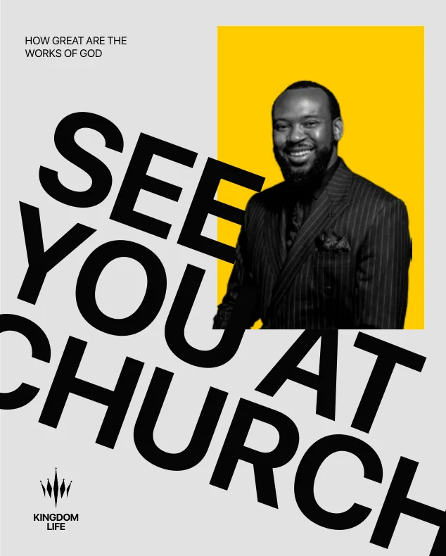
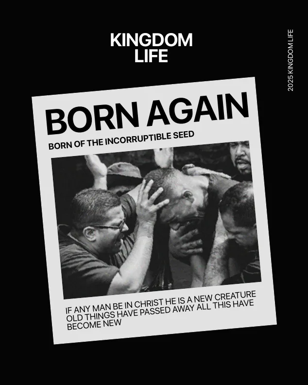
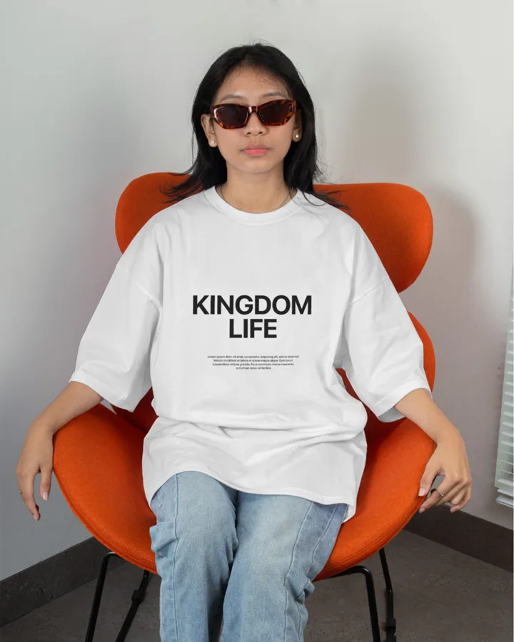
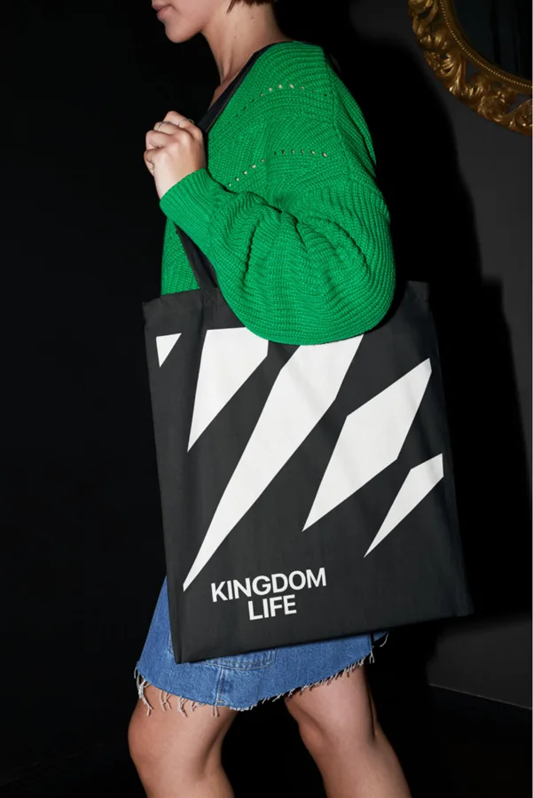
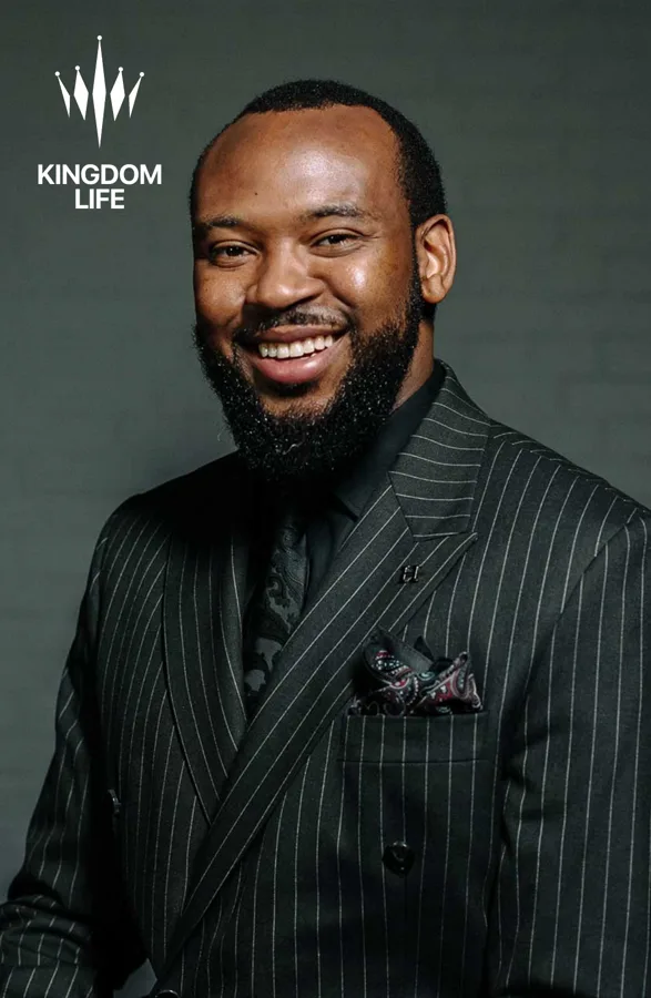
Social templates, photography and merchandise all draw on the same crown, colours and type. Bold headlines, the black, off-white and gold palette and the crown as a mark or pattern give every sermon post, invite and piece of merch the same voice.
The results
Church growth goes beyond design, so the results here are what the system delivers: clear differentiation from generic church branding, unified recognition across five ministries and four cities, and consistency across digital and physical touchpoints. Kingdom Life now has one system its ministries and cities can grow into.
What we took from it
- Mission before motif. A custom symbol with meaning beats borrowed clichés every time.
- Give every room its own light. Sub-brands can be distinct and still clearly part of one family.
- Write it down. A 23-page guide is what keeps a growing, volunteer-run brand consistent.
Does your brand look like what it carries?
Book a call and we will show you how one clear system can hold your whole organisation together.
More Case Studies
How four localised assets a week grew Netflix Nigeria on Instagram from under 10K to 600K+ followers.
NECLive 2025: one fingerprint, shaped into a continent, carried from screens into the venue.


